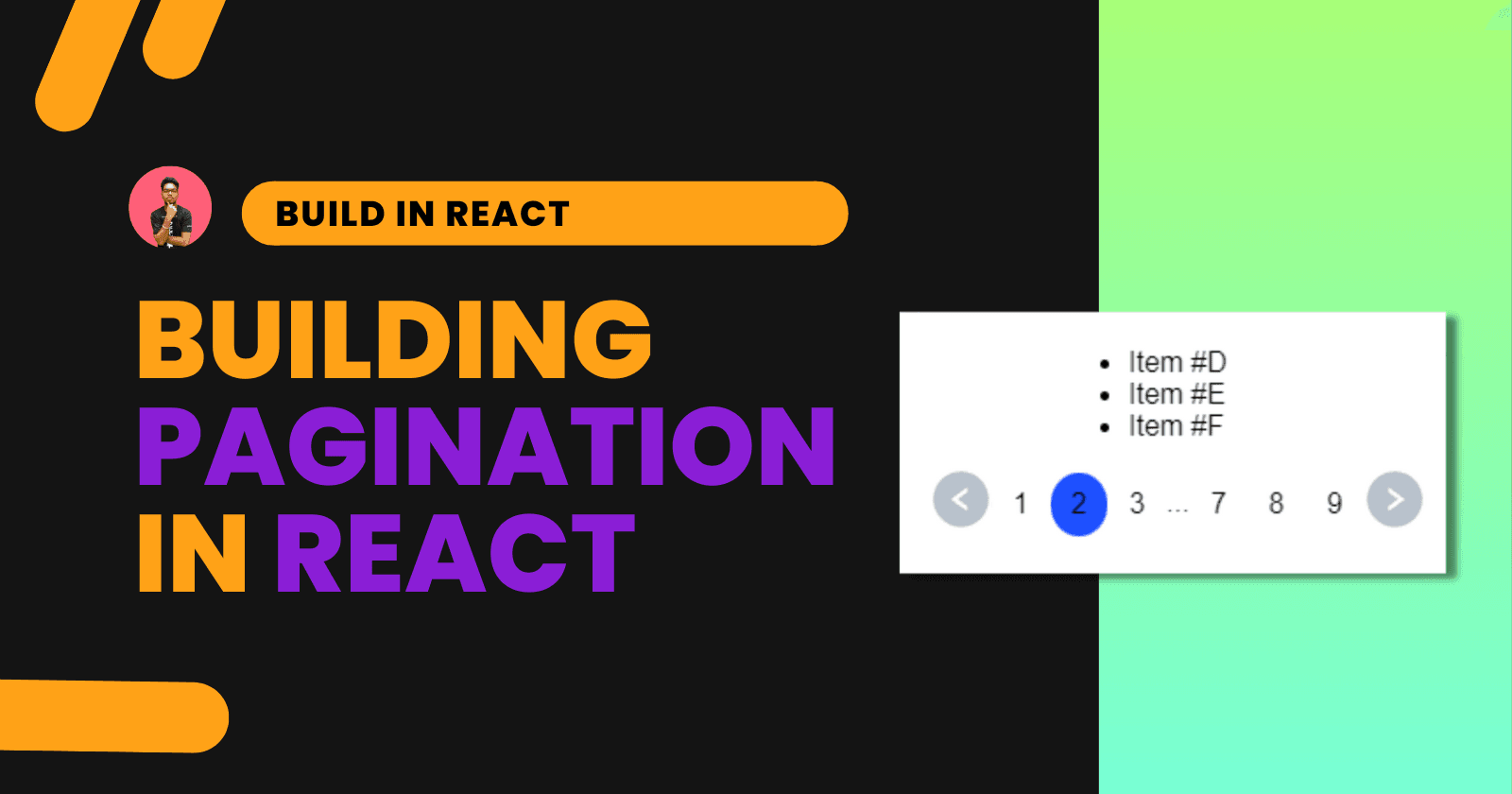
Building Pagination in React with React Paginate
Building Pagination in React with React Paginate
Suraj Vishwakarma
Updated
Originally Published
Navigation Map
Introduction
Pagination is a crucial component of any web application, as it enables efficient and seamless navigation through large sets of data. In React, implementing pagination can be challenging—especially for beginners. However, with a proper understanding of React components and hooks, building pagination becomes a straightforward task.
In this article, we’ll walk through the steps involved in building a pagination system in React, from setting up the component structure to integrating it with your application's data. This guide will provide a comprehensive overview and equip you with the knowledge and skills needed to build an effective and user-friendly pagination system.
We'll cover the following topics:
- Installing the required components
- Understanding the
react-paginatelibrary and its props - Filtering data for each page
- Creating the pagination component
- Final thoughts
Let’s get started.
Installing the Required Libraries
We’ll use the react-paginate library to build our pagination functionality. Install it using the following command:
npm i react-paginateWe'll also use icons for navigation. For that, we’ll use the react-icons library. Install it with:
npm install react-icons --saveApp.js: Setting Up the Component
We’ll build an application that displays data from an array. Each page will show only 3 items (you can customize this number based on your requirements).
Imports
Here are the necessary imports for the component:
import ReactPaginate from "react-paginate"; // Pagination component
import { AiFillLeftCircle, AiFillRightCircle } from "react-icons/ai"; // Navigation icons
import { IconContext } from "react-icons"; // Icon styling context
import { useEffect, useState } from "react"; // React hooks
import "./styles.css"; // CSS styling
Sample Data
We’ll use a simple array of alphabet letters as our dataset:
const data = [
  "A", "B", "C", "D", "E", "F", "G", "H", "I", "J",
  "K", "L", "M", "N", "O", "P", "Q", "R", "S", "T",
  "U", "V", "W", "X", "Y", "Z"
];
Using useEffect and useState
These are the state variables used in our component:
const [page, setPage] = useState(0);
const [filterData, setFilterData] = useState();
const n = 3;page: Stores the current page numberfilterData: Holds the filtered dataset for the current pagen: Defines the number of items per page
Filtering Data with useEffect
useEffect(() => {
  setFilterData(
    data.filter((item, index) => index >= page * n && index < (page + 1) * n)
  );
}, [page]);
The filter method slices the data array based on the current page index. For example, on page 0, it returns items with indexes 0–2.
Rendering the Component
First, let’s render the filtered data in an unordered list:
<ul>
  {filterData && filterData.map((item, index) => <li key={index}>Item #{item}</li>)}
</ul>
Adding the Pagination Component
<ReactPaginate
  containerClassName={"pagination"}
  pageClassName={"page-item"}
  activeClassName={"active"}
  onPageChange={(event) => setPage(event.selected)}
  pageCount={Math.ceil(data.length / n)}
  breakLabel="..."
  previousLabel={
    <IconContext.Provider value={{ color: "#B8C1CC", size: "36px" }}>
      <AiFillLeftCircle />
    </IconContext.Provider>
  }
  nextLabel={
    <IconContext.Provider value={{ color: "#B8C1CC", size: "36px" }}>
      <AiFillRightCircle />
    </IconContext.Provider>
  }
/>
ReactPaginate Prop Descriptions
| Prop | Description |
|---|---|
containerClassName | CSS class for the pagination container |
pageClassName | Class for individual page numbers |
activeClassName | Class applied to the active page number |
onPageChange | Callback function triggered when the page changes |
pageCount | Total number of pages (data length / items per page) |
breakLabel | Label used for skipped page ranges |
previousLabel | Custom previous page button (uses icon) |
nextLabel | Custom next page button (uses icon) |
CSS Styling
Here’s the CSS used to style our pagination component:
.App {
  display: flex;
  font-family: sans-serif;
  margin: 0 auto;
  align-items: center;
  justify-content: center;
  flex-direction: column;
}

.pagination {
  list-style: none;
  height: 31.5px;
  width: 31.5px;
  display: flex;
  justify-content: center;
  align-items: center;
  margin-top: 2px;
  cursor: pointer;
}

.active {
  background-color: #1e50ff;
  border-radius: 50%;
}

.page-item {
  list-style: none;
  padding: 2px 12px;
  height: 31.5px;
  width: 31.5px;
  display: flex;
  justify-content: center;
  align-items: center;
  margin-top: 2px;
}
CodeSandbox Demo
You can explore the complete code and see the output live on CodeSandbox:
{% codesandbox react-pagination-92b4sj %}
Conclusion
Building pagination in React is a fundamental task that enhances the user experience by improving data accessibility and navigation. With the help of the react-paginate library and React hooks, you can easily implement a robust pagination system tailored to your application’s needs.
We hope this tutorial has helped you understand the process of creating a pagination component in React. If you found this article useful, feel free to share it with your peers. Thanks for reading!